

Roles: user research, visual design, concept design | Tools: Figma, Adobe XD, Canva, Google Docs, Google Forms | Duration: 2 months

problem
Brides all over the world share the universal stress that comes with wedding planning. The uncertainty of everything falling into place on the big day is overwhelming and daunting for most brides. According to a Zola study, 71 percent of couples find weddings to be more nerve-wracking than any other major life event. Is there a way to make this process a bit more stress-free?

Solution:
Wifely is an app created to centralize bridal services so that brides-to-be are able to locate these services without having to utilize multiple search engines and browse through hundreds of social media profiles to find the one right for them


We needed to create a way to connect these two groups of users (brides-to-be and artists/designers)

User Interviews
To understand our target users, we conducted user interviews to deduce common pain points and what the users are looking for as it relates to fulfilling all of their future bridal needs (or reflecting on their bridal needs in the past for those who are already married). This consisted of 17 people total: 4 unmarried, 7 engaged, and 6 married women.
Unmarried/Engaged:
Getting a wedding gown on time (4)
Knowing what kinds of services are nearby (2)
Don’t know what to expect (9)
Getting inspo from other women (4)
Want to know more about the service provider/ be in touch with them before booking (3)
Wants process to be as stress-free as possible (10)
Married:
Wished they could get insight from other brides (5)
Did not know what they were getting themselves into prior to booking services (2)
Wished they could ask other brides for help (1)
Regretted not understanding their needs first before planning (2)
Access to services in one centralized physical or digital space (3)


User personas


Sketches
Low-fidelity wireframes
Usability Studies
After the first round of wireframing and prototyping, 5 participants were asked to complete 3 tasks that explored the main functions of the app in an in-person moderated usability study

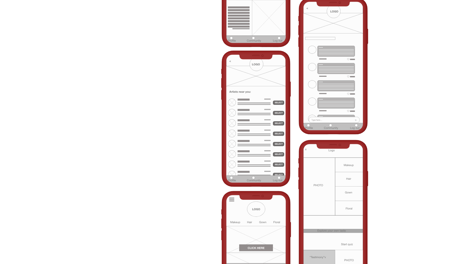
Based on the fact that 4 out of 5 users expressed that the CTA buttons to request information on hair stylists, makeup artists, gown designers, and florists were difficult to locate, we decided to redesign the homepage and move those buttons to the top.
Based on the fact that 3 out of 5 users found the group chat feature to be confusing to navigate, we added an additional title section on the page header and additional navigation buttons above the messages to increase clarity.
Insights
High-fidelity prototypes


Skills gained: UX and UI design, usability studies, data analysis, design systems
What would I do differently?
-> Include a group of service providers in the user interviews and usability tests.
-> Do a separate usability test with the service providers
-> Conduct a second round of usability testing to gather insight on the effectiveness of the changes made
-> Add more features to create a customized feel (such as a bridal “checklist” feature)
This project was one of 3 that were created during the Google UX Certification program, an intensive and rigorous program offered by Google and designed to propel individuals forward through covering the design process from end-to-end.